
Dreams of Me
"You're
still a Whisper..."
![]()
![]()
![]()
![]()
![]()
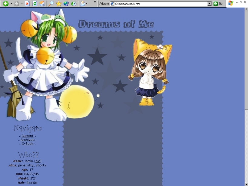
"Digi
Charat Blues"
![]()
![]()
![]()
![]()
![]()
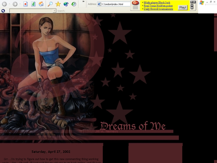
.: Jill
vs. Nemesis :.
![]()
![]()
![]()
![]()
![]()
I love the Resident Evil series. I made this layout after I saw the amazing
Resident Evil movie. I really loved this layout, and it stayed up for a long
time.
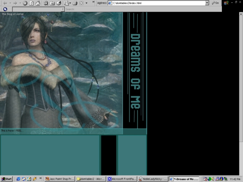
"This
is how I FEEL"
![]()
![]()
![]()
![]()
![]()
Lulu is so pretty! :P That is exactly why I used her in this layout. I did
edit the picture a lot on the top, but the design of the tables is almost
exactly the same as the layout below with some color changes.
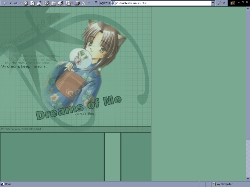
"My Dreams keep me Sane"
![]()
![]()
![]()
![]()
![]()
This was my first attempt at making my blog a single page, with tables. It
worked out okay, but I am still learning. I am sort of new to using all tables
on pages and no frames. I really liked this picture, and thought it suited my
domain name since it was a cute little cat girl. I was going to use it for my
main domain page, but then I decided it would work better for this site when I
started experimented with it in Paint Shop Pro. I got sick of this layout really
fast though, so *POOF* it'z outta' there!
"Cyber
Swim"
![]()
![]()
![]()
![]()
![]()
okay. Blue again! lol. Well I do like to use blues in my layouts, that's for
sure! I really liked this picture and just had to use it for something. I was
pretty proud of this layout when I finally got it up too!
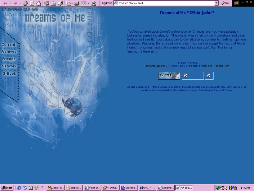
"Take me to the Stars"

![]()
![]()
![]()
![]()
![]()
I think this layout is okay. It's very...blue. I found this picture somewhere on
the internet and thought it was really cute so I decided to use it for my
journal layout. This layout features a character from the anime "Love Hina".
I've never saw this anime before but I hope to soon. It looks really cute! This
is the current layout for my journal site, but I'm sure I won't be keeping this
layout for long.
"Yummy Strawberries"

![]()
![]()
![]()
![]()
![]()
Ahh! This one makes me hungry! I love this layout! It features Kero-Chan from my
favorite anime, Card Captor Sakura! He's just so cute! I used a lot of red in
this layout which is also different from my normal style. I usually use a lot of
purples and blues for some reason, so this was a nice change. This one is
defiantly one of my all-time favorite layouts so far!
"Floating Away"
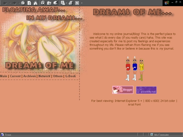
![]()
![]()
![]()
![]()
![]()
This was another layout that is "different" in my style. I used a lot
of earth colors for this one, and a lot of tables within frames. My friend said
it looked a faerie thing. I really liked this layout at first, but it seemed
sort of plain after a while because the only main graphic was the menu/title
thing of the side.
"Blue Lady"
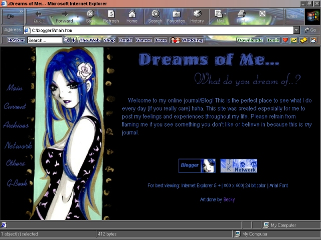
![]()
![]()
![]()
![]()
![]()
A lot people told me they liked this layout. I did too. I got tired of it really
quick though. It was still a bit dark for my taste, but I still like it. I
really liked the shades of blue in this layout. The layout featured art by a
very talented girl named Becky.
"Kimono
Green"
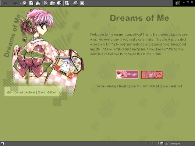
![]()
![]()
![]()
![]()
![]()
I really liked this layout. It took a lot of work and time to edit the image on
the side. It features Hiraku from The Magic Knights Rayearth. I also thought
this was an original color of green to use for a layout. This is one of my
favorites.
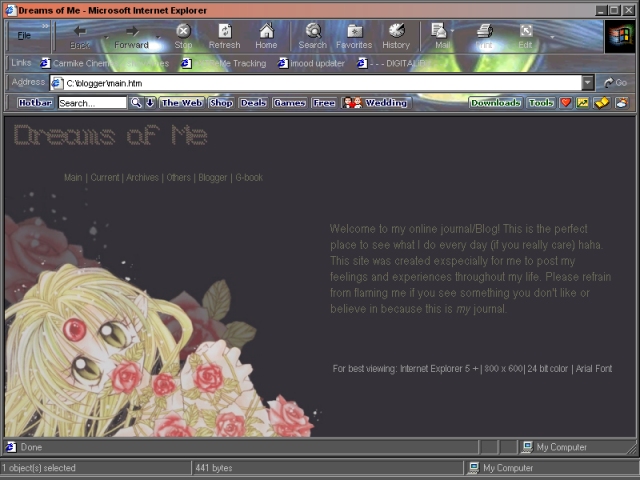
"Lovely
Roses"
![]()
![]()
![]()
![]()
![]()
This was the first layout for my journal site called Dreams of Me. I liked this
layout at first, but I got sick of it fast. I don't go for all the browns and
dual colors in it. Plus, there wasn't much effort on my part. I just resized and
image, cut it, and stuck it on the side.