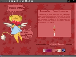
Ahh! This one makes me hungry! I love this layout! It features Kero-Chan from my favorite anime, Card Captor Sakura! He's just so cute! I used a lot of red in this layout which is also different from my normal style. I usually use a lot of purples and blues for some reason, so this was a nice change. This one is defiantly one of my all-time favorite layouts so far!
"Floating Away"
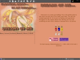
This was another layout that is "different" in my style. I used a lot of earth colors for this one, and a lot of tables within frames. My friend said it looked a faerie thing. I really liked this layout at first, but it seemed sort of plain after a while because the only main graphic was the menu/title thing of the side.
"Blue Lady"
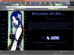
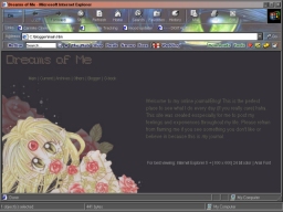
A lot people told me they liked this layout. I did too. I got tired of it really quick though. It was still a bit dark for my taste, but I still like it. I really liked the shades of blue in this layout. The layout featured art by a very talented girl named Becky.
